Fidelity Spire / FeatureSpire Guest Membership
Most financial apps ask you to commit before you've seen anything. Guest Membership flipped that. Prospects given the same access as customers behaved like customers. The gate was the problem, not the product.
The Team: I led the design for Guest Membership as a horizontal effort across six squads. While Onboarding, Track, and Accounts were aligned to the Spire roadmap, the Security team (sign-up) operated on an external, separate timeline.
My Role: I acted as the connective thread across these squads to reconcile conflicting roadmaps and ensure a coherent user journey from registration through to account management.
Objective: Design Fidelity’s first prospect-level mobile experience, allowing users to explore Spire before opening an account.
Success Metric: Increase total account openings by capturing the prospect segment.
One user in mind
Trish is a millennial in her late 20s to mid-30s, balancing debt and savings goals, fee-averse, and deeply skeptical of financial institutions. She needed to see the product before she could trust it. GM was designed to give her that. More about Spire →
The core constraint
Opening financial accounts before seeing an experience was a main deterrent for prospects. In traditional financial services there is no ‘profile’ without a financial account.
financial account = access to financial platforms
The insight
“I don’t know how helpful (this app) is going to be because I can’t see how it’s going to work. In my situation because I don’t have an account, I can’t see how it functions…”
Hypothesis
If we remove friction (decouple sign-up from account opening) and give prospects access to the features customers value (Track and Accounts), they'll experience value before committing and conversion will increase.
Guest membership was born
Only way a prospect could experience truly personalized experience, learn about whats “behind a wall” without a financial account and experiencing value before committing.
Demo Mode ✗
Fake data, simulated experience
Nothing persists — start over at sign-up
Doesn't build trust — builds skepticism
Guest Membership ✓
Your goals, your data
Real Fidelity profile created
Everything transfers at account opening
Key architectural decisions centered on making sign-up do double duty. Information a prospect entered to become a guest member carried forward seamlessly into account opening when they were ready to convert.
Registration experience skeleton architecture, three sequential steps map prospect information directly into account opening, eliminating redundant data entry
The focus was collecting the minimum upfront: name, phone, email, then credentials. Everything entered transferred to a full customer-level account after conversion, with nothing asked twice and nothing asked before it was needed.
Goal information transfers from guest membership into the full experience
Enrollment details feed directly into account opening
Credentials carry over to a customer-level account after converting
At a glance
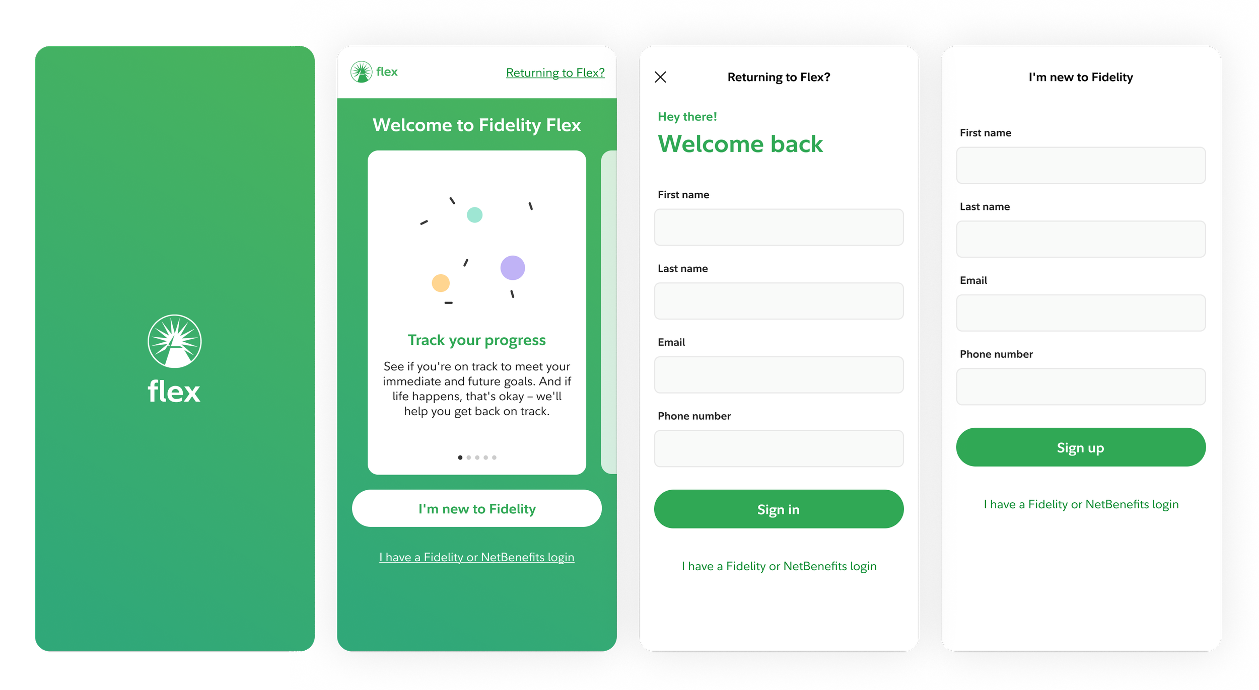
Fresh install
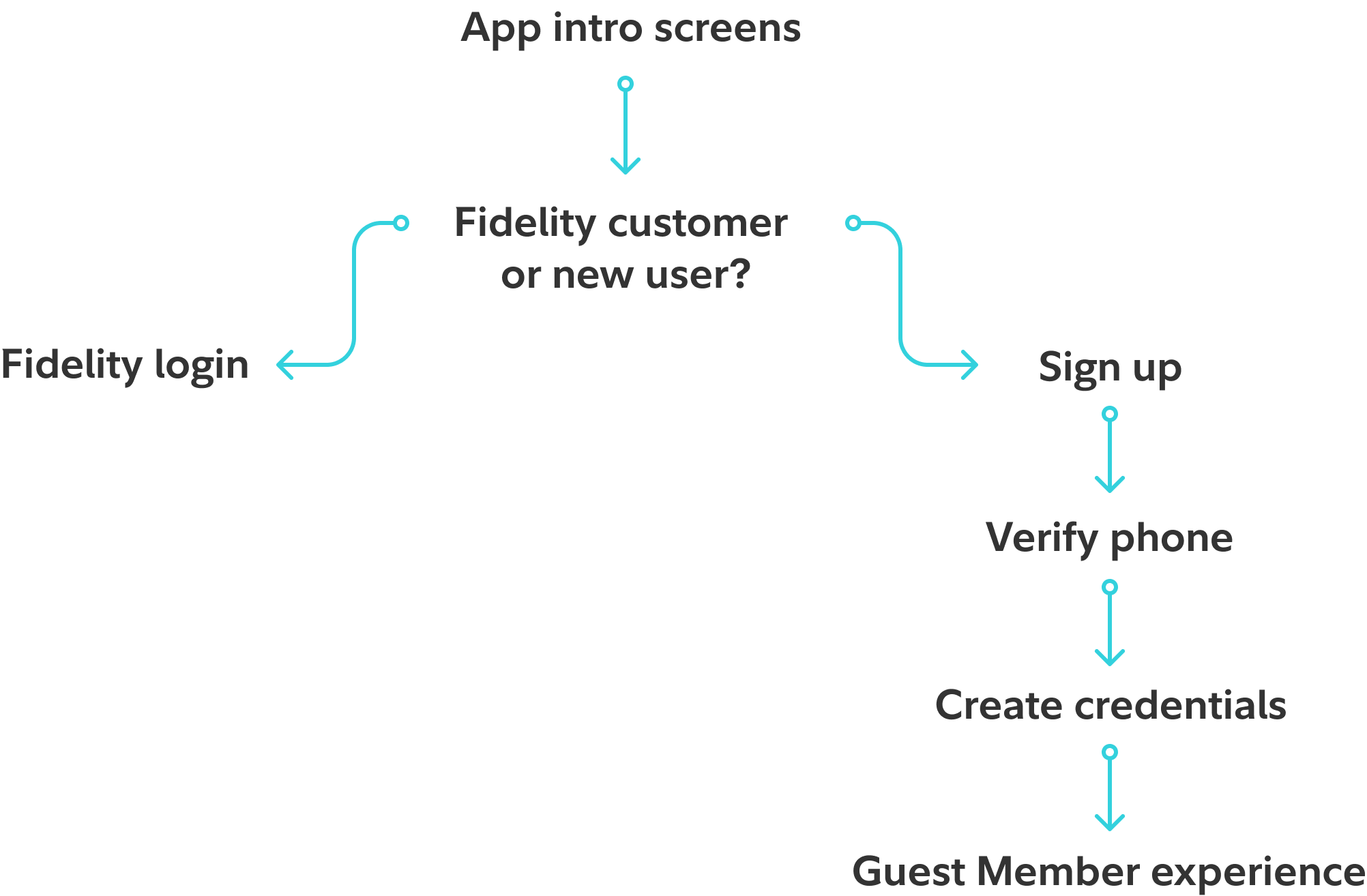
Fresh install: Intro screens lead to a login or sign-up fork. Prospects continue through verification and credential creation into the Guest Member experience.
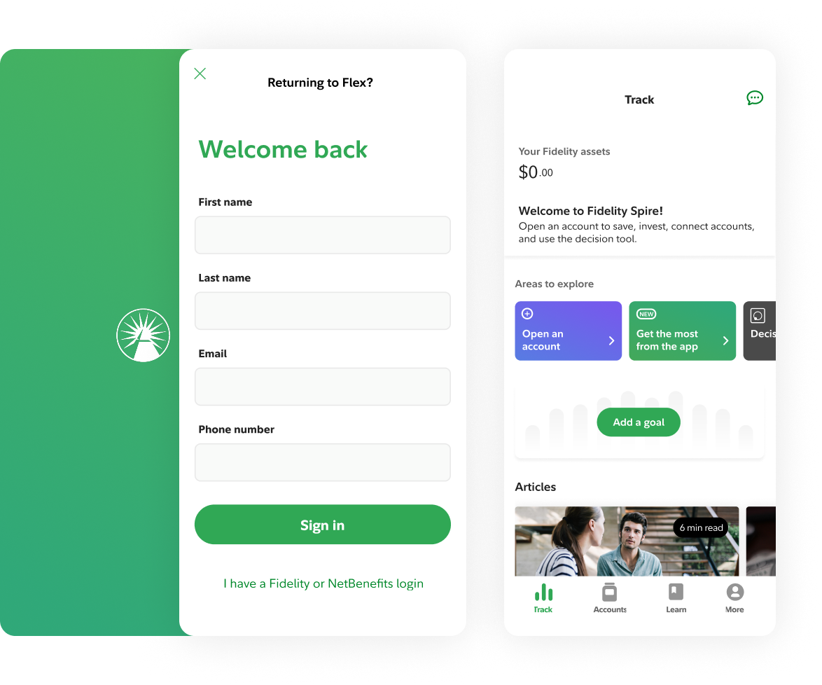
Returning user
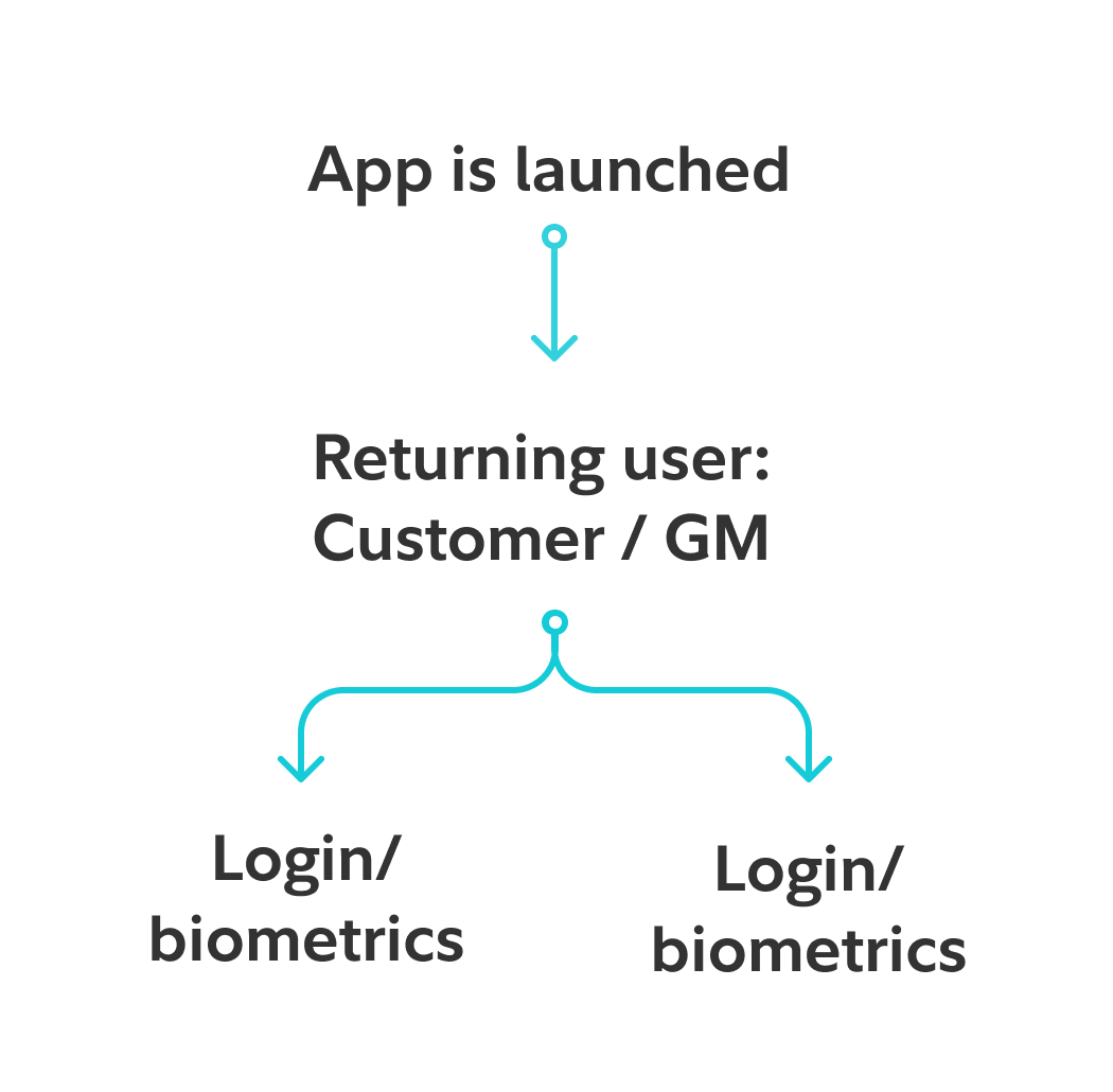
Returning user: Existing customers and guest members skip onboarding and authenticate directly via login or biometrics.
Entry points
Four different use cases. How many entry points? Entry points for different users had to be established. Fresh install required orienting prospects with no Fidelity data, returning Guest member, customers and customers who forgot they have a Fidelity relationship.
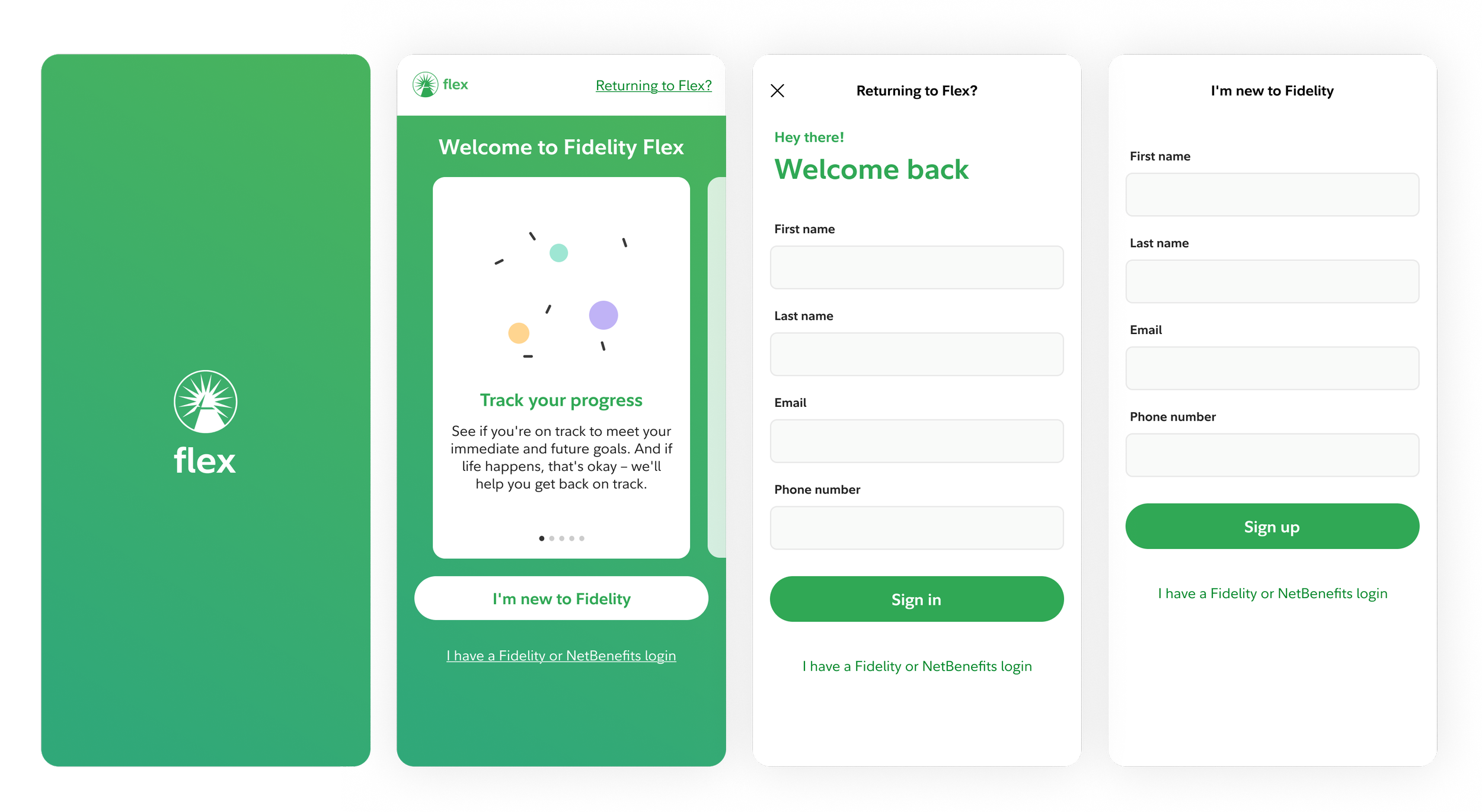
Two intro screen iterations exploring how to communicate value to prospects before asking them to sign up.
Signing up
We explored two approaches, splitting the form across pages versus keeping everything on one scrollable view. The keyboard behavior on mobile made this more nuanced than it sounds: fields needed to advance naturally as each was completed, keeping the user oriented without losing their place.
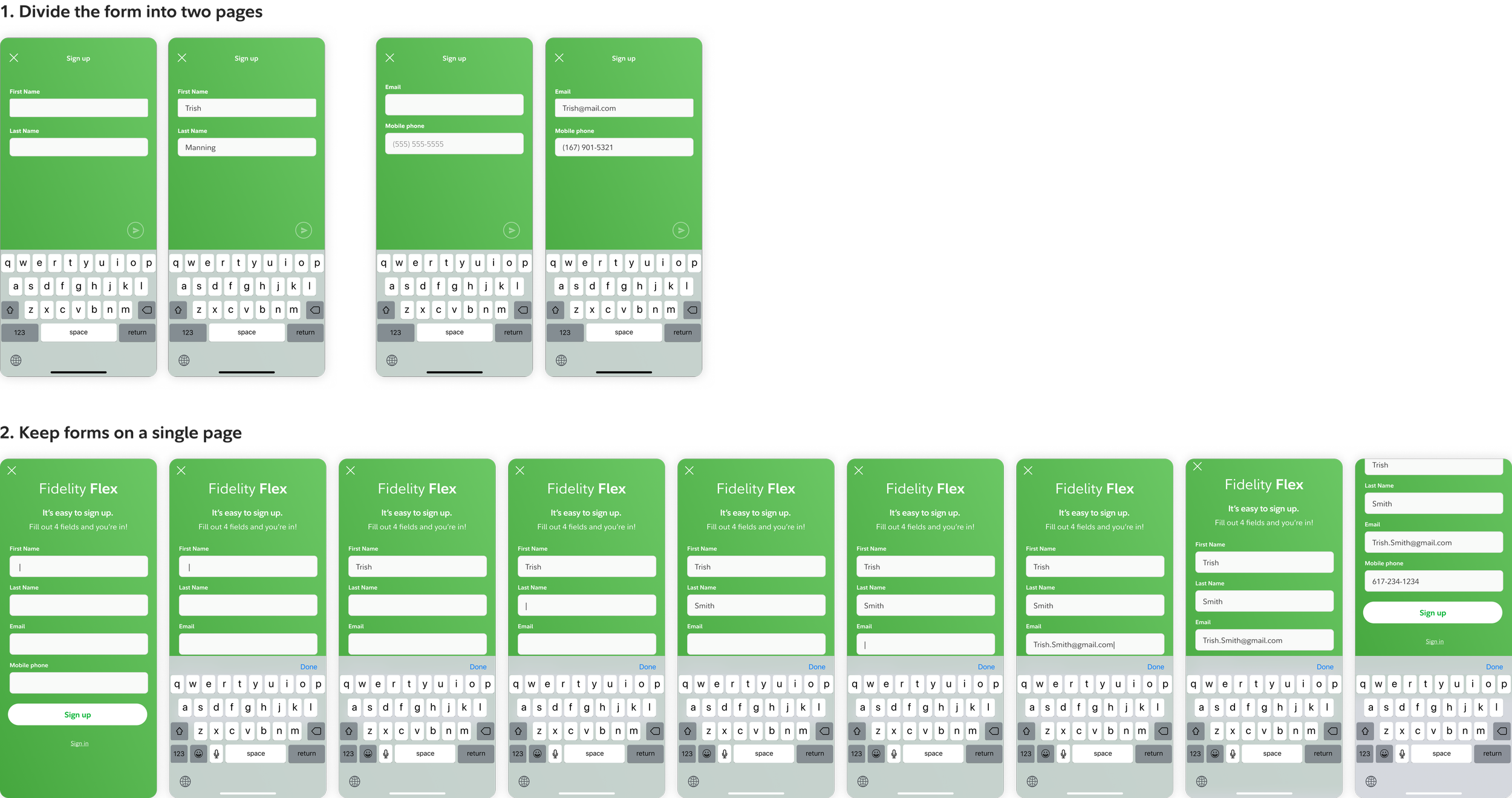
Two sign-up form approaches: paginated (top) versus single scrollable page (bottom). Field advancement and persistent keyboard on the single-page version reduced disorientation during mobile input.
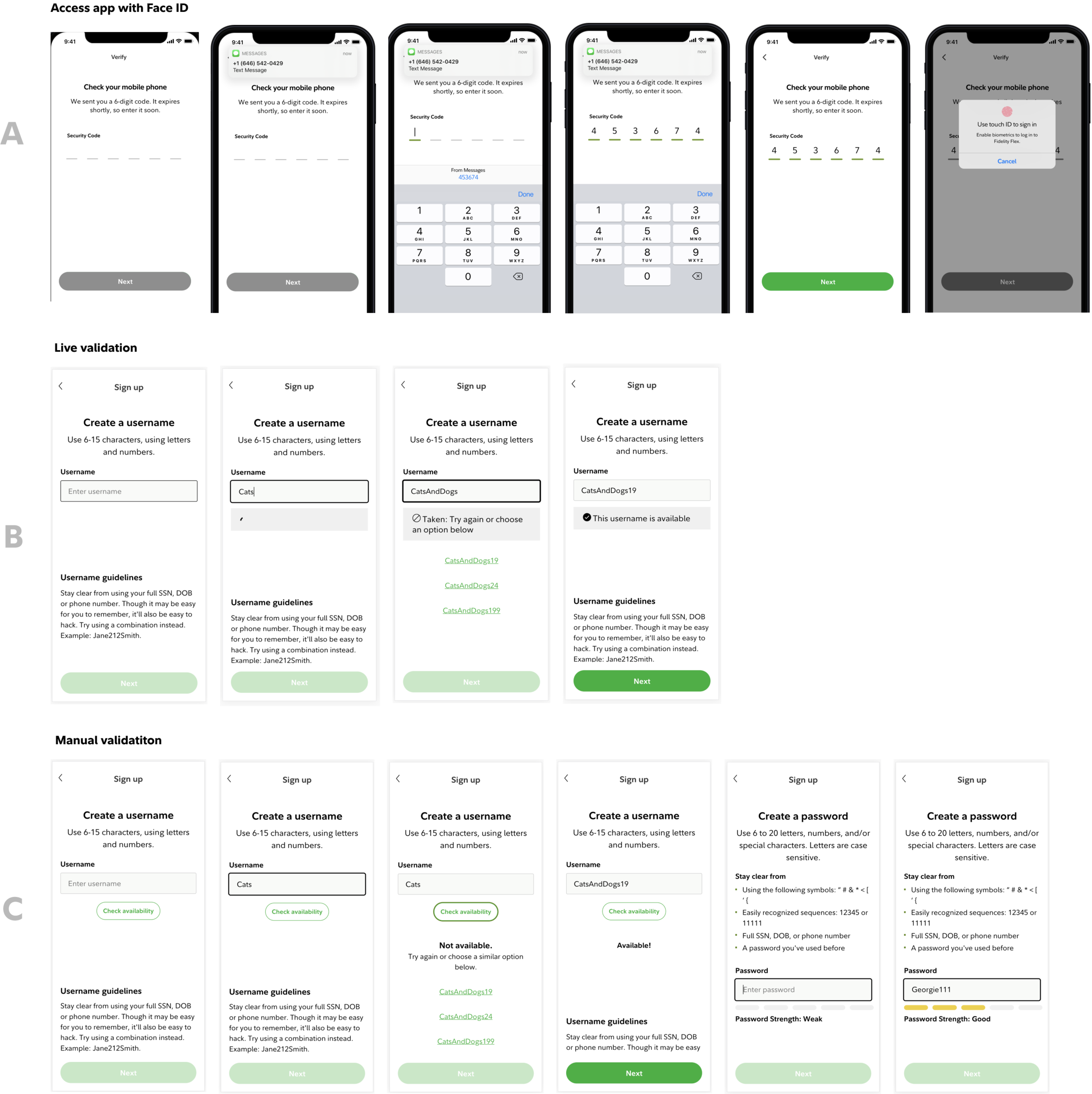
Step 3: Credential creation
Speed matters during sign-up because any friction is a reason to abandon. I explored live inline validation for username availability and password requirements, testing it against static requirement lists to see which helped users move faster and with more confidence.
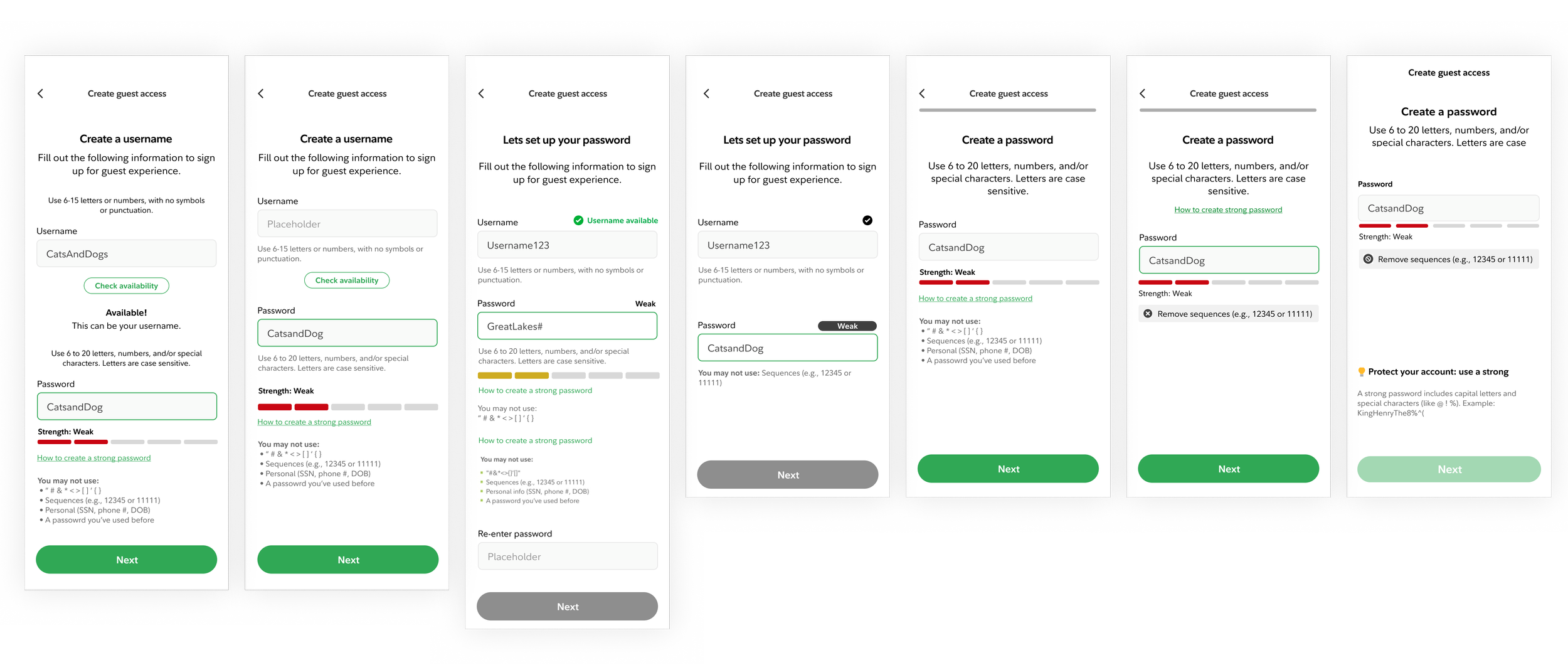
Explorations of live inline validation where username availability and password strength surfaced in real time so users could course-correct before submission.
Sign up study
Usability testing surfaced three clear signals:
Prospects completed sign-up faster and with fewer errors using real-time inline validation than static requirement lists
Prospects feel comfortable using Face ID / biometric login to open an account. (Although people wanted the ability to make a username/password as a backup in case they didn’t feel comfortable.)
Prospects understand when they sign up for guest membership, they have not opened an account with Fidelity
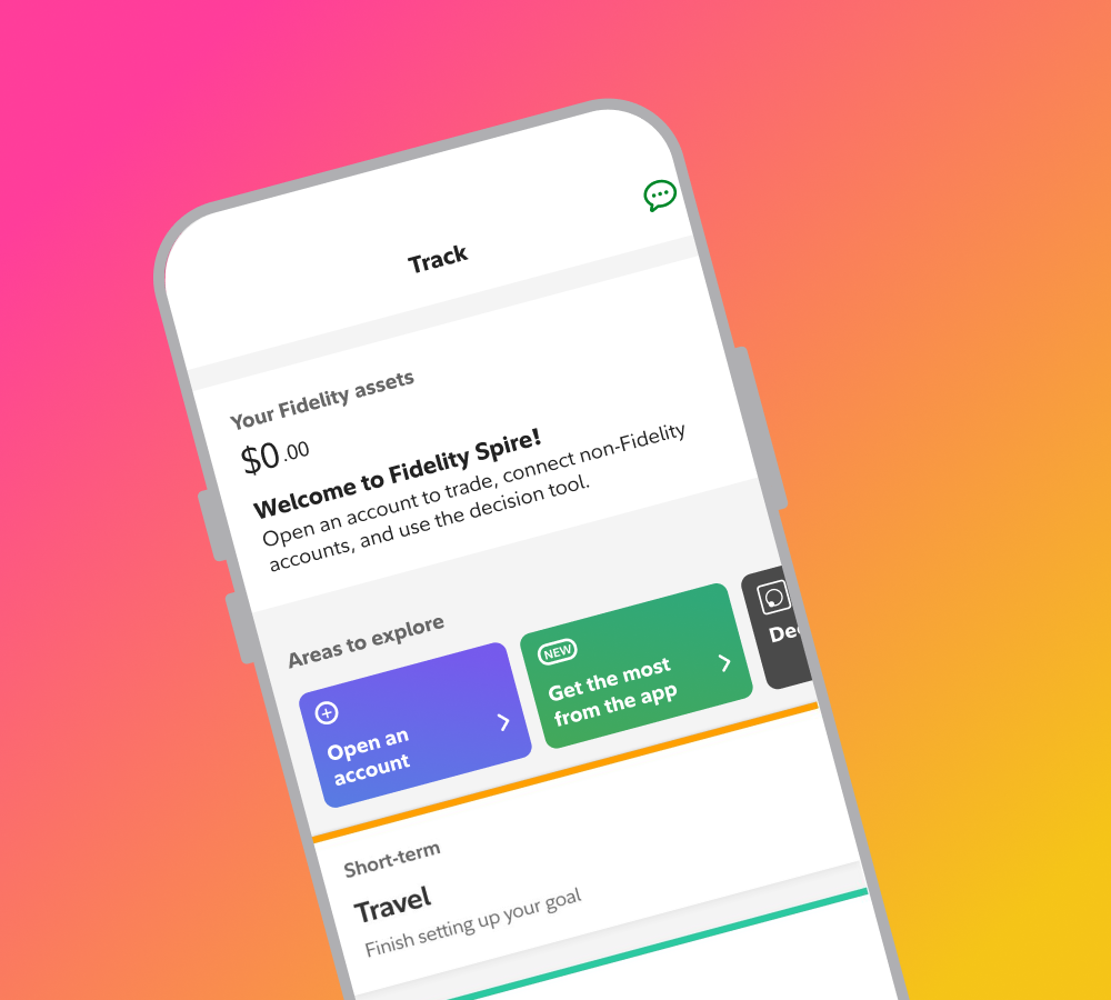
Post registration: Core Guest member experience
Once registered, a guest member landed in a version of the app where most of the experience carried over but not all of it worked the same way. Goals could be selected in onboarding, tracking required an account, learn was fully available. Track, Accounts, and More needed decisions. The diagram maps what was shareable, what needed reconfiguration, and what remained open with Accounts as the central unresolved question.
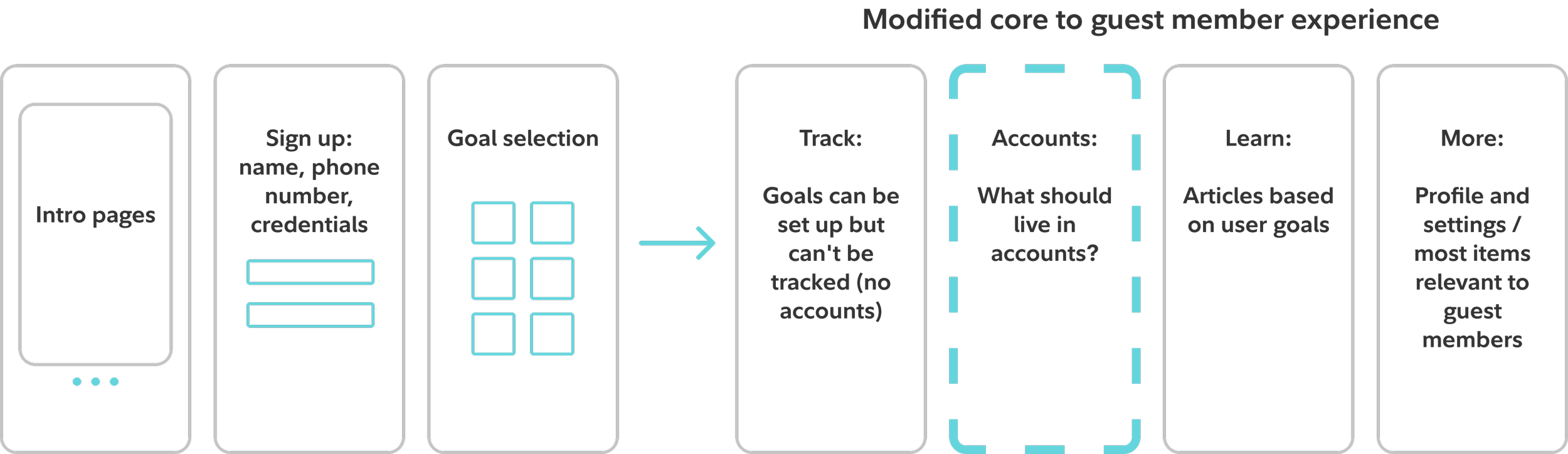
Mapping which core app sections carried over to guest members as-is and which needed redesign. Accounts was the open question; More was largely reusable.
Accounts page purpose and design
The Accounts tab had no clear brief for guest members. It couldn't show their accounts because there weren't any. But leaving it empty wasn't an option either. We had to figure out what this space should even be before we could design it. The explorations below weren't about polish, they were about answering a more fundamental question: could this tab become a conversion surface, and if so, how?
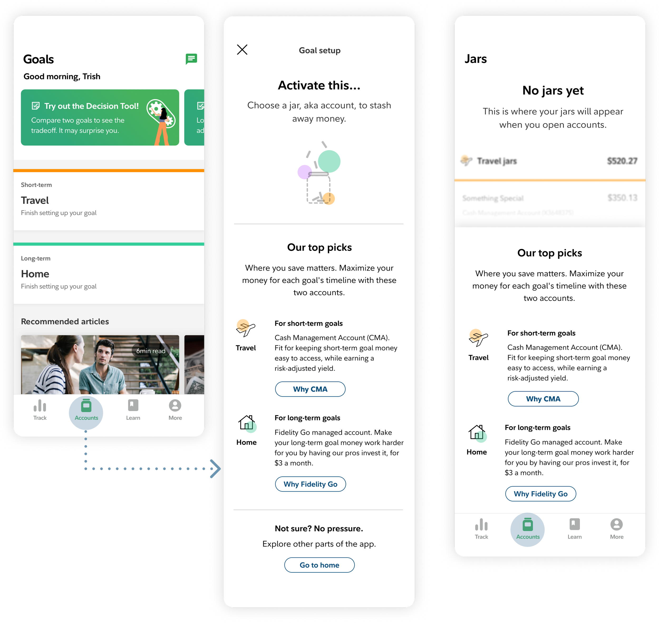
The left concept uses a modal to connect account recommendations to the user's goals; the right lands users directly on the tab and orients them from there.
The approach was to treat it as an education surface, not a blank state. Rather than showing nothing, the tab surfaced account options matched to the goals a guest member had already selected during onboarding. The goal through-line that started at sign-up carried directly into this page, so the account recommendations felt personal rather than generic.
A quant survey and image annotation study
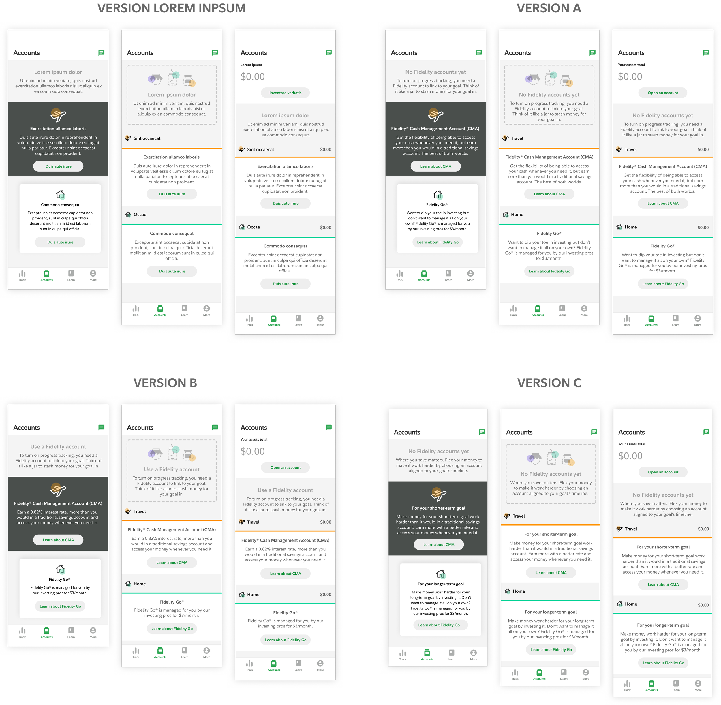
Versions tested
Nine screen configurations: three layout concepts crossed with three language variations, randomly rotated across participants. Each person annotated what felt helpful or confusing directly on screen, then answered questions on fit and comprehension. The goal was to separate how much language vs. layout was driving clarity.
Concept C won consistently: balance at the top ($0.00), goal-labeled subtotals inline, clean hierarchy. Users came to the Accounts tab expecting to see a number. When it was there, everything read clearly. CMA labeled for short-term goals, Fidelity Go for long-term, the ambiguity the other concepts opened was resolved.
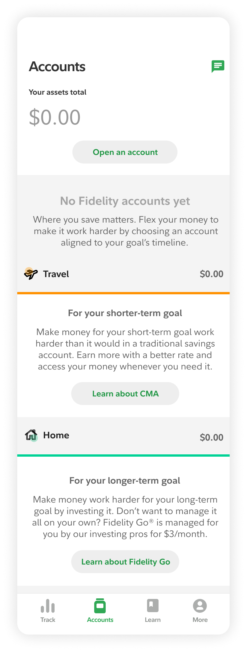
The Goal-based account layout was the winning layout and language. Accounts listed in the order goals selected during onboarding, so the products shown felt relevant to why the user signed up in the first place.
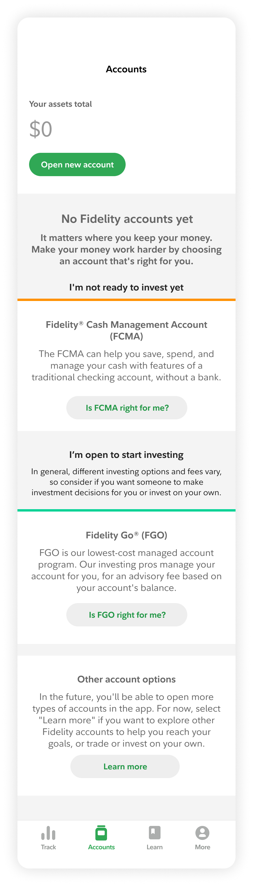
Content evolved post multiple legal reviews and an Intent based layout was proposed instead. Accounts grouped by user intent, making the page scannable regardless of what the user selected at onboarding
Quick pivot solution
The security team face an upstream team dependency causing misalignment with Spire's launch and risking server-side persistence delivery. I pushed the idea of saving data locally and design a returning user flow. Spire shippped with client-side persistence while server-side caught up.
Designed a temporary fallback entry point registration bridge while upstream team dependencies were resolved.
Results
65% ≈ 64% prospects visited Accounts at the same rate as customers, indicating intent was never the issue.
6,663 guest members converted to full accounts
23% of all in-app account openings in 2021
Prospects given the same access as customers behaved like customers. 65% visited the Accounts tab — compared to 64% of customers. 35% engaged with Track, vs. 36% of customers. The data confirmed what the design assumed: the gate was the problem, not the product.
Reflection
If I were doing this again, I would push for an explicit technical feasibility checkpoint early. Not standing progress meetings, but a dedicated cross-squad conversation about dependencies before build began. The server-side persistence constraint was discovered late because it lived in the gap between teams, not in anyone's individual update. That's a coordination problem, not a technical one.
Prototype reflects the full release, backend infrastructure enabled, prospect profiles live and interim solution retired.
© 2026 Julia Barbosa. All Rights Reserved.