Wealthscape / FeatureBook analytics
Book analytics replaced a Tableau-based reporting tool inside Fidelity's institutional advisor platform with a purpose-built analytics experience organized around how advisors actually think about their books, not how data is stored. The tool shipped in part to financial advisors managing client books across the firm.
The Team: PM, Engineering, Research, Business Lead, 1–2 additional designers
My Role: I owned the visual design, interaction design, and data visualization design for the product. Working from a shared IA and wireframe foundation, I selected chart types and defined visual encoding across each analytical view, designed the interaction layer on top of the charts, and brought the full experience into production quality within the existing advisor platform.
Objective: Help advisors identify at-risk and high-potential clients faster.
A reporting tool that wasn't built for decisions
Book Analytics lived inside the same institutional platform as WealthCentral and Streetscape. Advisors were working out of a Tableau-based tool that could answer questions, but only the ones you already knew to ask. It required manual configuration to produce a useful view and had no native sense of what an advisor's workflow looked like. The project brief was to replace it with something purpose-built: an analytics experience organized around advisor intent, designed to surface insight rather than wait to be configured into relevance.
The advisor managing a book of clients
The primary user was a financial advisor responsible for dozens to hundreds of client relationships simultaneously: tracking performance, identifying who needed attention, and finding where growth opportunity might be hiding in the book. They understood financial data but didn't have time to configure dashboards. The data that could help them act, who was at risk, whose AUM had quietly declined, which younger clients had high potential, was buried behind queries they had to build themselves. Most of the time, they didn't.
Advisors had the data. They didn't have a way to act on it.
The Tableau tool was built around data queries. It answered the question you put to it. That model works for analysts. It doesn't work for advisors context-switching between client calls, managing a pipeline, and running a book across a full day. The cost of forming the right query was high enough that most advisors defaulted to what they already knew and skipped the analytics entirely.
The consequence was invisible risk. A client's AUM had been quietly declining for months. A younger client had significant unrealized potential that hadn't been flagged. A segment of the book was underperforming relative to the rest of the region. None of it surfaced unless someone went looking, and the tool made looking hard.
"Data points that stand out from the pack may represent an unidentified opportunity."
Mapping how advisors read their books
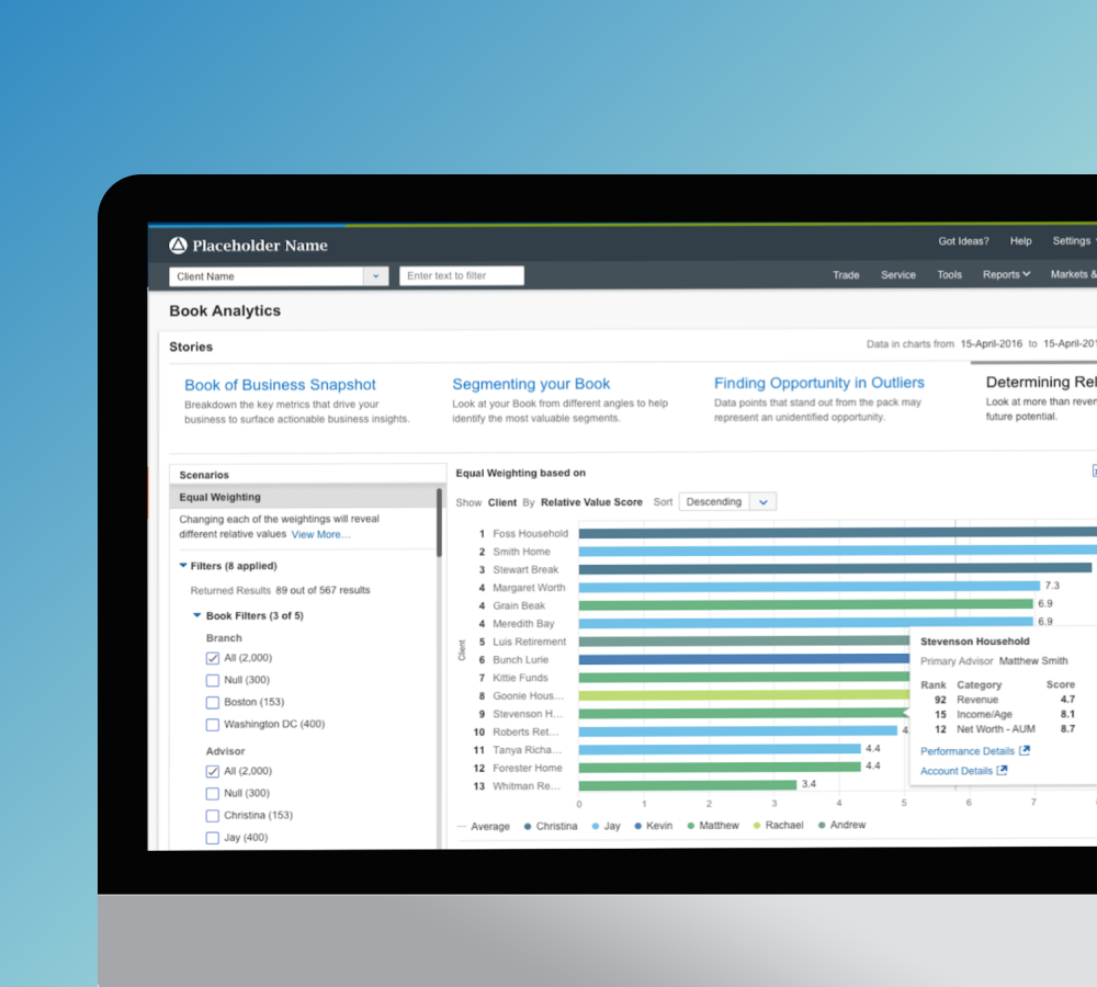
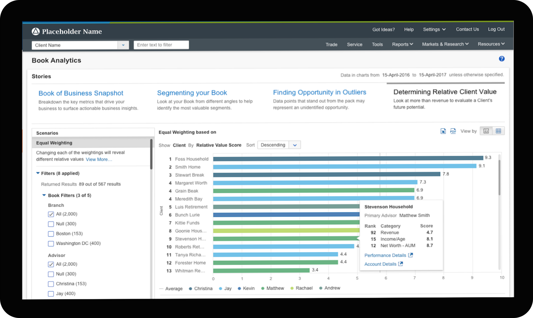
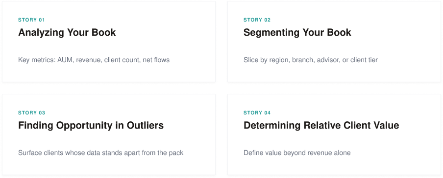
Research mapped how advisors actually navigated their client data and what questions they were trying to answer. The output shaped the product's core organizing logic: four analytical lenses, each framed as a "Story," each answering a different question an advisor might have without requiring them to build the query themselves.
Each Story supported a Scenarios panel: pre-built filters tied to a specific business question. "Clients at Risk" plotted client age against change in AUM as an early signal for follow-up. Each scenario came with a plain-language description and a linked resource. The intent was to give advisors a starting point, not an empty chart.
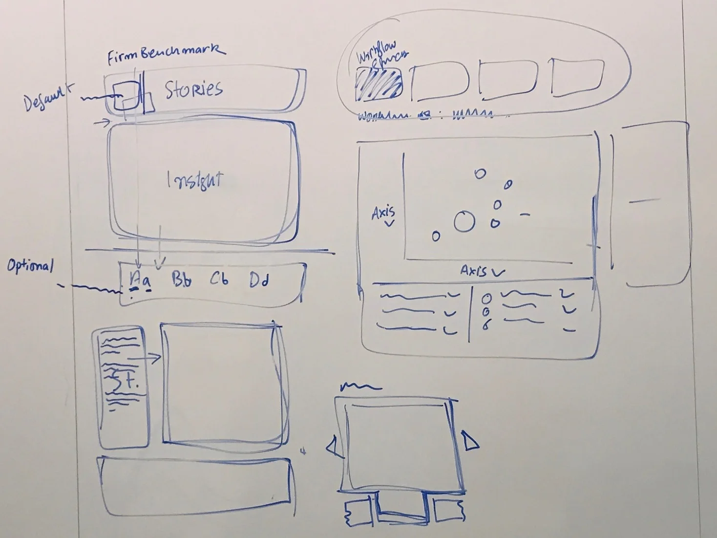
From information hierarchy to interaction system
The wireframe phase worked through a recurring structural question: how should the insight, the narrative Story, the criteria that produced it, and the supporting snapshot relate to each other on the page? The team tested this across a range of configurations before the right hierarchy emerged.
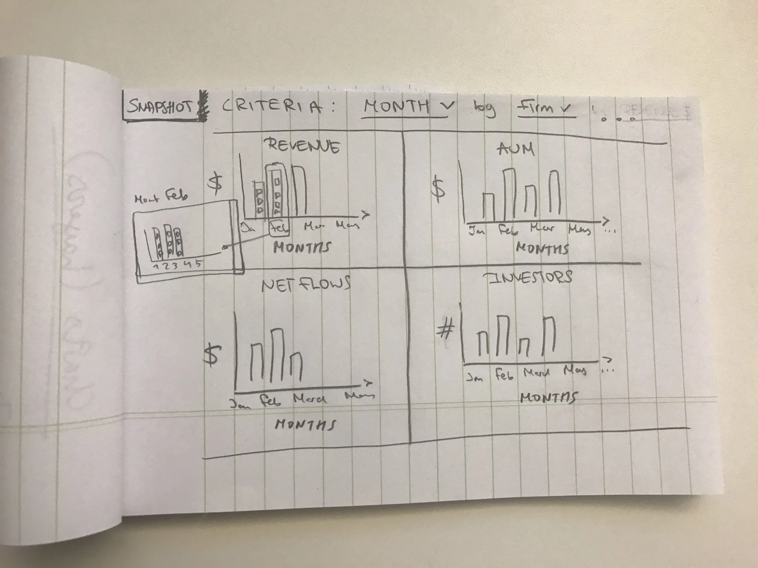


Early layout explorations. Color coding (blue for Stories, purple for Insight, pink for Snapshot, yellow for Justification, green for Criteria) tracked component roles across iterations.
A "Front & Center" direction emerged midway through: surface the key insight on load rather than requiring the advisor to navigate in. The question it raised was whether an outlier even needed a chart, or whether the narrative could do the work on its own.
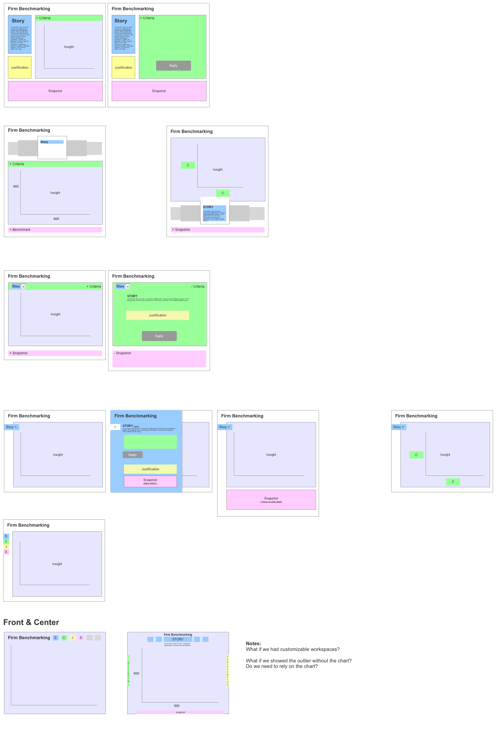
Mid-stage explorations, including a Story Wizard concept for guided entry. File note: "bubble up the list of issues, be served with problems or positive information."
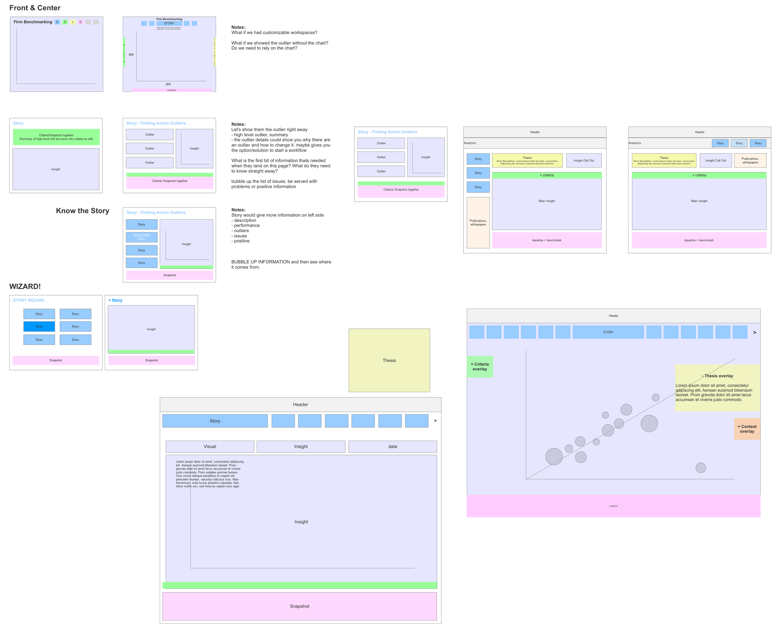
Later explorations landing on header-anchored Stories navigation with contextual overlay panels. This became the structural basis for visual design.
My work covered the visual and interaction layer, including all data visualization design. Each Story presented a different analytical question, so each view required its own answer about chart type, visual encoding, and what an advisor needed to read immediately versus what lived on drill-down. The interaction layer followed from those decisions: hover states, tooltips, and data cards designed around what an advisor would need to act, not just what the data could surface.
The Outliers view is the clearest example. The bubble chart plotted the entire client book against two variables, with bubble size encoding total AUM. A hover state on any client surfaced a data card with key figures and direct links to Account Details and Performance Details.

The Outliers bubble chart in the "Clients at Risk" scenario. Size encodes total AUM. The hover card surfaces the data an advisor needs to act, without leaving the view.
Shipped in part. No retained metrics.
The Stories framework and core dashboard views reached production within the advisor platform. Specific adoption or usage data wasn't tracked in a way that survived the project. What the work established was a design approach for advisor-facing analytics: organized around analytical intent rather than data structure, with the system doing the interpretive work so advisors didn't have to.
Left in the backlog
Several directions didn't make the initial release. The Story Wizard, a guided entry point for selecting a starting Story, was scoped out in favor of direct navigation. The full scenario filter model was designed but not fully shipped. A natural next phase would have been saved scenarios, so advisors could return to views they'd built without reconfiguring from scratch.
© 2025 Julia Barbosa. All Rights Reserved.