
Fidelity Spire / FeatureExternal accounts
Users were telling us exactly what they needed: a way to see all their accounts in one place, not just their Fidelity ones. We brought external account linking into Spire by integrating an existing web-based aggregation tool called FullView, giving users a complete financial picture without leaving the app. The challenge was making that hybrid solution feel native and trustworthy.
Team: Design, Engineering, FullView Specialists, Business
My Role: Led all design on the integration from auditing the existing webview flow and identifying experience gaps, to exploring and validating layout directions, to designing the goal-linking patterns. Worked closely with a dedicated business partner and FullView team specialists throughout.
Objective: Bring external account linking into Fidelity Spire in a way that felt native and trustworthy, within the constraints of an existing webview infrastructure.
Working within what existed
Fidelity already had a web-based account aggregation tool called FullView, built on eMoney Advisor. The goal was to pull that capability into Spire rather than build from scratch. That meant the design work was as much about integration and optimization as it was about net-new design.
Webview experiences carry inherent limitations. At Fidelity, shipping at pace sometimes means working with existing infrastructure and improving on it incrementally. The first step was understanding exactly what FullView offered and where it created friction.
Two types of users, one flow
The experience needed to work for two groups: users new to FullView who would enroll through the app for the first time, and users already enrolled on the web who were encountering it in Spire for the first time. Each path had different starting points but converged on the same accounts page.
The app is good so far. If only I could add my other accounts and have those linked to my goals.
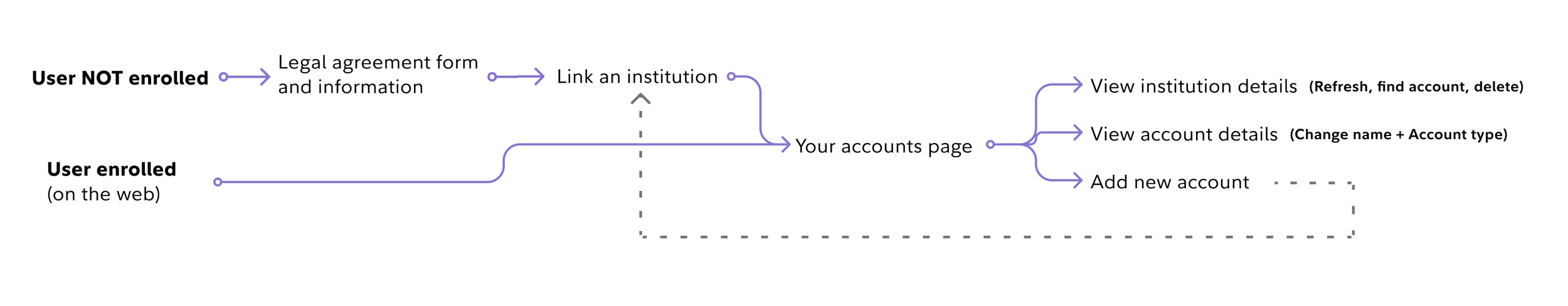
Flow map showing the non-enrolled path (legal agreement, link institution, accounts page) and the enrolled path (direct to accounts page). Exits: view institution details, view account details, add new account.
The existing webview had real gaps
Before exploring any new directions, the existing FullView screens were audited screen by screen. Several issues were identified.
Navigation was redundant. Cancel, exit, and back buttons overlapped in ways that would confuse users about how to move through or leave the flow. Credential error messages were too specific about what had failed, which raised a security concern. The Save button was active before a user had made any edits. And it was unclear how institutions and accounts would be ordered on import.
Annotated walkthrough of the existing FullView webview, with issues and open questions identified at each step.
The optimal end state was clear: accounts that update automatically, full account details available, with transfer and ETF functionality in place. This audit established how far the existing webview was from that, and what could realistically be addressed in this release.
Two directions, one constraint
Two layout approaches were explored for how external accounts would live in the app. Version A placed Fidelity and external accounts on the same page, with institution-level grouping, last-updated timestamps, and an external net worth figure. A single view of a user's full financial picture was the direction we wanted to land in.
Version A: external accounts not set up (left) and set up (right), shown inline with Fidelity accounts on a single page.
Version A wasn't feasible for this release. API constraints prevented external balances from appearing reliably alongside real-time Fidelity data. Showing stale balances next to live figures was a trust problem. There was also no way to route users to external account detail pages the way Fidelity accounts supported. Version A stayed on the board as the intended future state.
Version B separated Fidelity and external accounts into two tabs. It respected the existing page construct, avoided the stale balance problem, and gave external accounts a clean, dedicated space without requiring a broader redesign of the Accounts page.
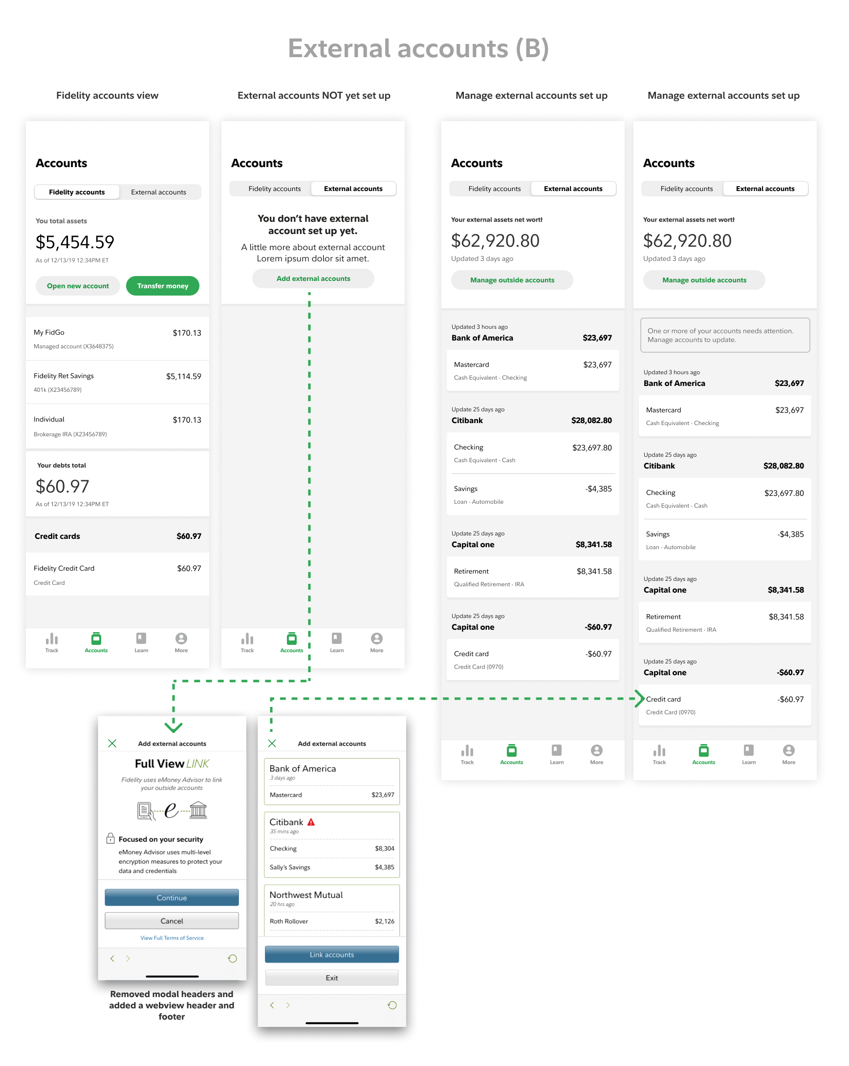
Version B: Fidelity accounts and External accounts as separate tabs. Empty state, set-up state, and error state. Modal headers removed from the webview; replaced with a native header and footer.
A key structural change in Version B was removing the modal headers from the webview and replacing them with a native header and footer. This reduced layered navigation and made the transition into the webview feel more continuous.
Recovering space in the webview
With Version B confirmed, the focus shifted to getting as much usable space and clarity out of the webview as possible. The current state packed a modal header and a fixed stacked button footer into an already constrained viewport, particularly on smaller devices.
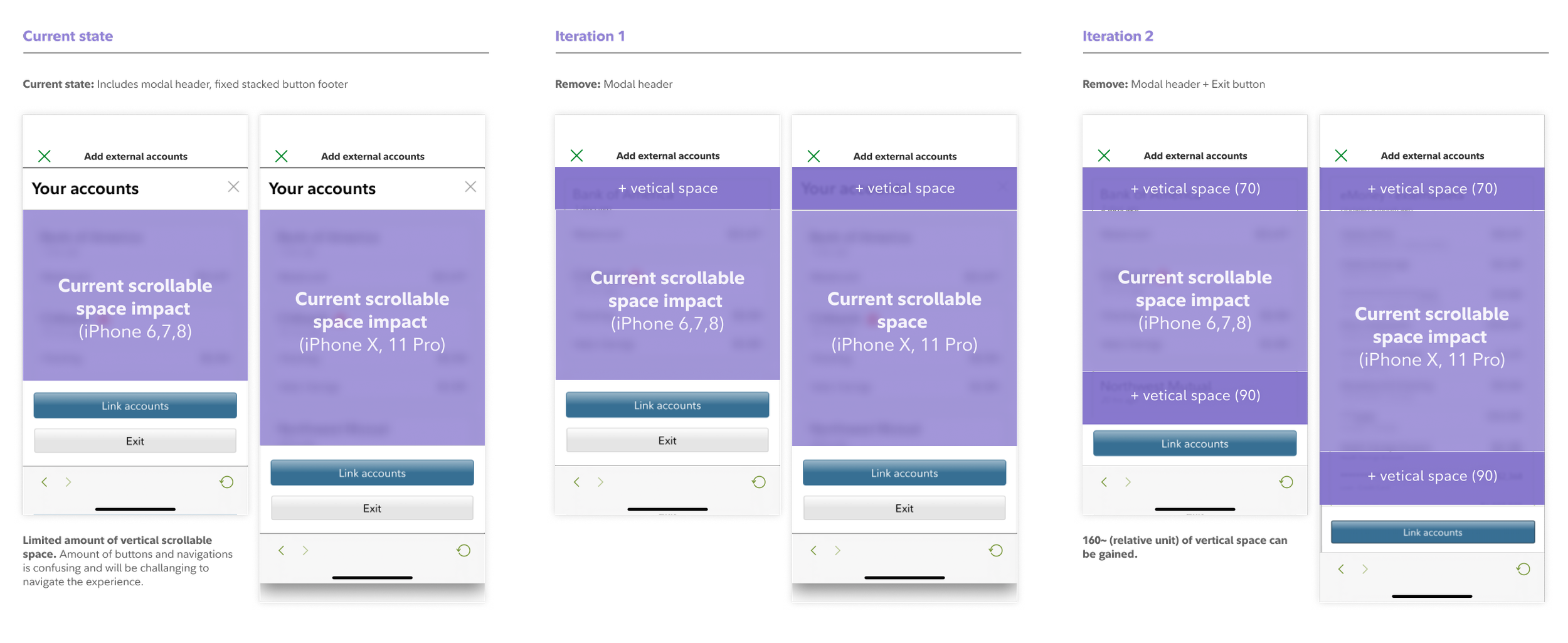
Scrollable space analysis across three states: current (modal header + stacked footer), Iteration 1 (modal header removed), Iteration 2 (modal header and exit button removed). Approximately 160 relative units gained across both device sizes.
Removing the modal header in Iteration 1 and the exit button in Iteration 2 recovered approximately 70 units on iPhone 6/7/8 and 90 on iPhone X/11 Pro. It also simplified navigation and fewer redundant controls meant a clearer path through the flow.
A naming problem
"Fidelity accounts / Non-Fidelity accounts" as tab labels created confusion. The framing put the emphasis on what something wasn't. We revised the labeling to "Fidelity accounts / External accounts", more direct, and easier to understand at a glance.
Linking external accounts to goals
One of the more purposeful parts of the design was connecting external accounts to goals. From the Accounts tab, linked institutions were grouped by goal: Travel jar, Home jar with unlinked accounts collected under "Unassigned jars." Goal order mirrored the home page arrangement.
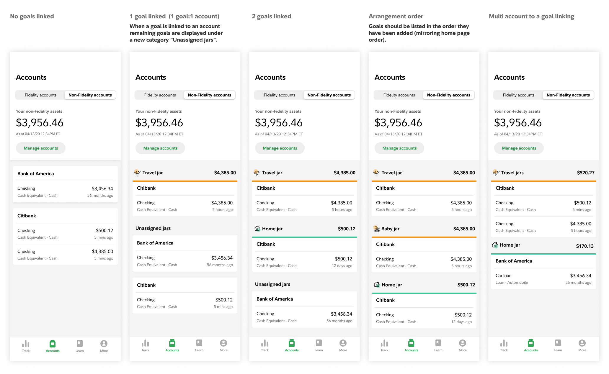
Goal-linking states — no goals linked, one goal linked (unassigned jars appear), two goals linked, arrangement order, and multi-account to one goal.
From the goal detail page, users could link or unlink an account to a goal directly, with a confirmation step before any change was made. Once linked, the account's balance and transactions appeared within the goal view.
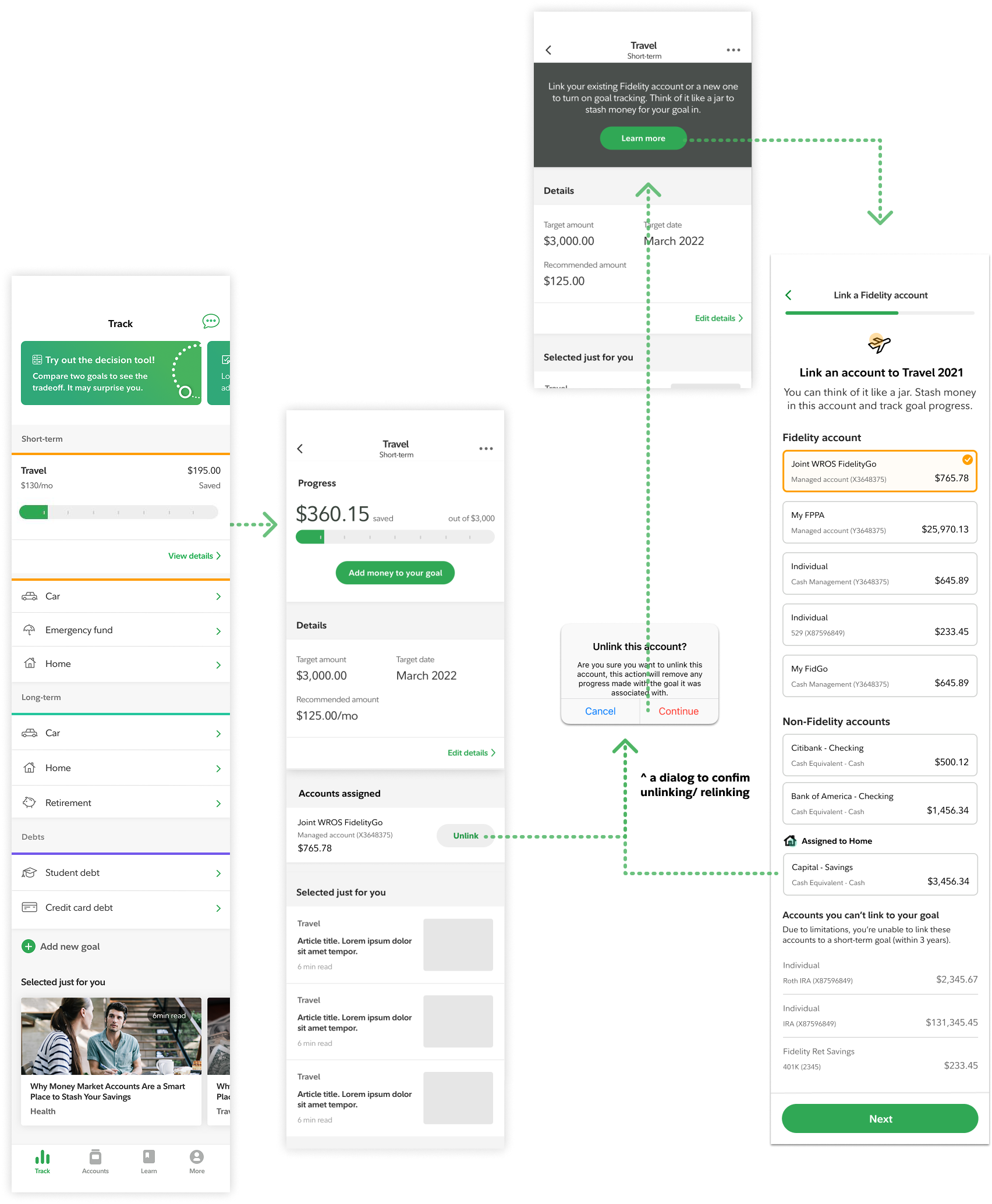
Goal-linking states — no goals linked, one goal linked (unassigned jars appear), two goals linked, arrangement order, and multi-account to one goal.
This gave users a way to see their external accounts in the context of what they were saving for. We heard positive feedback on it and it helped users distinguish between accounts and gave meaning to balances that would otherwise just be numbers.
Shipped design
Tested prototype used to validate the enrollment and account-linking flow.
Android version
A foundation for what followed
Version B shipped in February 2020 as a pragmatic response to real API constraints. The tab construct was designed to translate cleanly into a unified view once those constraints were resolved, and it laid the foundation for the native version of the experience that was built after.
© 2026 Julia Barbosa. All Rights Reserved.