PPA / FeatureCoaching landing page
The coaching landing page was the entry point for both prospects and PPA customers arriving from the Roadmap. Drop-off was high, and the proposition wasn't landing. This case study covers the experimentation process: copy testing, layout testing, hallway research, and a CMS-constrained redesign that shipped to both audiences.
Where it started
The coaching pages didn't come from a brief. They came from a question the squad had been sitting with: how do we get Suzie the help she actually needs?
Through a research and JTBD sprint, looking at past data and surfacing the key gaps in how customers like Suzie were being served, the squad identified that a human touchpoint, a way to reach her with relevant, personalized guidance, was the missing piece. That work is what established coaching as an offering worth building around. View Coaching Appointments→
This case study picks up from there: once coaching existed, how do you explain it to someone who's never heard of it?
How coaching reached users
Personalized Planning and Advice (PPA) was Fidelity's hybrid advisory service, combining digital tools with access to human financial coaches. Coaching sessions were 1:1 calls on specific financial topics: budgeting, investment strategy, debt paydown, retirement planning.
There were two ways a customer encountered coaching. Prospects found the coaching landing page directly, typically through marketing or search. Logged-in customers arrived through the PPA Roadmap, a personalized dashboard that surfaced Next Best Actions based on their financial situation. One of those actions was a prompt to speak with a coach.
In both cases, the destination was the same page. And in both cases, a significant number of people who landed there left without scheduling.
PPA Landing page (Prospect)
The page customers and prospects encountered before the redesign. The coaching offering was described, but what a session actually involved and why it was relevant to this person, now wasn't clear. On the right PPA Roadmap (post login/ customer experience) that delivered NBA (next best action) after a series of questions and one of the cards was to speak with a coach.
Meet Suzie
Suzie is an accomplished, self-reliant woman who manages her household finances with intention. She does her research. She doesn't like feeling naïve or unprepared, and she's skeptical of advice that doesn't feel relevant to her actual situation. She wants a financial relationship built around her, not a generic product pitch.
The research surfaced a consistent theme: Suzie experiences anxiety about finances not because she lacks capability, but because the information and tools available to her don't match how she actually engages with money. She found Fidelity's digital experience hard to navigate, and the relationships felt transactional and outdated.
I am usually pretty anxious because I am just not good at that stuff."
PPA customer research
Jobs-to-be-done research ranked her highest-priority needs by opportunity score. The top four (managing cash flow, protecting what she has, handling unexpected demands, and making progress on what matters most) all pointed to the same underlying need: confidence that she's making the right calls, without having to become a financial expert to get there.
Research had already surfaced a consistent pattern: Suzie wasn't disengaged from her finances because she lacked interest. She was anxious because the tools and information available to her didn't match how she actually thought about money. A landing page full of financial services language wasn't going to reassure her. It needed to speak to where she actually was.
High drop-off, unclear proposition
Drop-off on the landing page was high. The hypothesis was that the proposition was unclear — that the word "coaching" was doing too much work without enough support. Vanguard had launched "Personal advisor services" as a competing frame. Fidelity's page used "coaching," a term that meant different things to different people.
For prospects, the problem was comprehension. They didn't know what a coaching call involved, who they'd be speaking with, or what they'd walk away with. The page described the service without making the value concrete.
For logged-in customers arriving from the Roadmap, the problem was relevance. The page felt generic, it didn't connect the coaching offer to the goals and situation the customer had already shared with the product. The Roadmap had surfaced coaching as a next best action, but the landing page didn't carry that context forward.
The insight that reframed the problem
Drop-off data pointed to a conversion problem. But digging into direct customer feedback revealed something more specific: people weren't dropping off because they weren't interested. They didn't understand what coaching actually was.
The word "coaching" was doing too much work. Customers asked questions like:
Is this a sales call? Who am I speaking with? What will we actually talk about?
PPA customer research
Prospects had no frame of reference for what a session involved. Logged-in customers, even those who had already shared their financial goals with the product, couldn't connect the coaching offer to their situation. The fix wasn't a copy tweak. It required dedicated space to explain the offering before asking anyone to schedule.
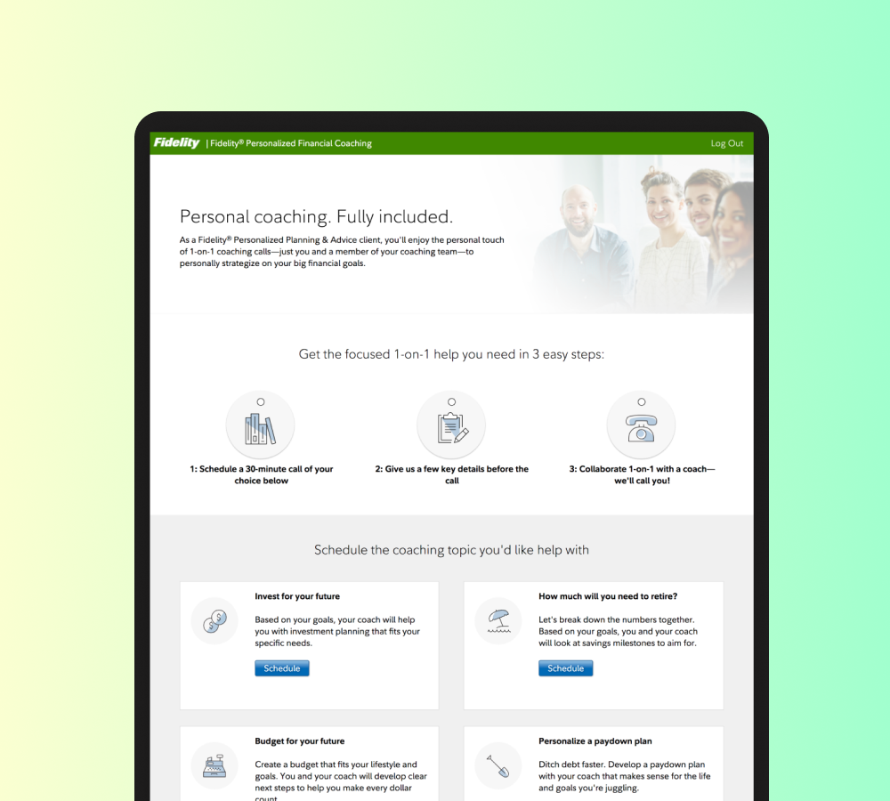
The Solution
We designed two "About Coaching" pages: one for prospects arriving cold, one for logged-in customers arriving from the Roadmap. The prospect version focused on comprehension, answering what coaching is, who you speak with, and what you walk away with. The customer version focused on relevance, connecting the coaching offer back to the goals and situation they had already shared.
Entry points added to the PPA landing page and the Roadmap's Next Best Action card, directing users to the new About Coaching pages.
Testing language, layout, and what coaching actually means
The first round of work focused on copy. Three headline and framing variants were tested against each other, with the goal of finding language that communicated what coaching was and why it mattered to Suzie's situation. The middle variant won: it led with the financial topic rather than the service type, making the coaching offer feel concrete and relevant rather than abstract.
A key addition was "Learn more" context for prospects on both sides of the page helping them understand what the call would actually involve before deciding to schedule. Customers had a Roadmap dashboard context that surfaced coaching as a next best action; the page needed to carry that relevance forward.
Three headline and framing variants tested against each other. The winning variant led with financial topic rather than service type.
Layout testing: vertical vs. horizontal
Two layout paradigms were tested in low fidelity before moving to hi-fi: a vertical timeline of steps and a more standard horizontal layout. The hypothesis was that the vertical version, by revealing steps progressively, would be more interactive and better suited to customers who needed to understand the process before committing.
Hallway testing produced a nuanced result. Customers preferred the simpler horizontal layout. It was easier to scan and faster to get to the coaching options. Prospects preferred the vertical version, which gave them more scaffolding to understand what the call would involve. Both groups found it easy to locate information and learn about coaching options.
Low-fidelity layout exploration. Vertical timeline tested against horizontal layout across both prospect and customer contexts.
High-fidelity explorations refining two layout directions: vertical and horizontal.
Hallway testing
Four prototypes went into hallway testing: two prospect variants (pre-login) and two customer variants (post-login). The testing validated the direction and confirmed which elements were carrying the most weight in each audience's experience of the page.
Hallway testing prototypes for prospect (pre-login) and customer (post-login). Both groups found the tested designs simpler to scan than the original.
Additional testing: introductory call framing and hero images
A separate round of temperature testing explored framing the coaching session as an "introductory call", a lower-commitment entry point designed to reduce friction for prospects who weren't ready to commit to a full session. Hero image options were also tested across multiple photography treatments, evaluating which visuals read as approachable and relevant to Suzie's situation rather than generic financial services imagery.
Temperature testing on "introductory call" framing and hero image options across multiple photography treatments.
Designing within the CMS
The final design direction was built within Fidelity's Tridion CMS, which had a built-in component library. The decision to use Tridion components was deliberate: it reduced development resource requirements and made future content changes copy updates, session topic edits manageable without requiring a designer or engineer for each change.
Working within Tridion meant adapting the design direction to available components rather than building from scratch. This constrained some visual decisions, but it also meant the page could be maintained and updated by content teams after launch.
The vision for where the page was heading: a persistent coaching hub where session history, notes, and upcoming calls accumulate over time. Left: Coaching Sessions tab with topic cards and pre-work. Right: Previous sessions tab with notes from past calls.
Reflection
A significant amount of time went into getting the language right. The coaching offering sat in an ambiguous space, not quite a product, not quite a service, and the copy had to make it concrete without over-explaining. Multiple rounds of testing on headlines, framing, and session descriptions reflected how much was riding on that first impression.
Layout exploration followed the same pattern, vertical, horizontal, low-fi, hi-fi, but the honest takeaway is that no amount of polish would have moved the needle if the content wasn't right. The content was the design.
Hallway testing was a deliberate choice given the pace. With an MVP mindset driving the timeline, it became the fast, low-cost way to pressure-test assumptions and check for personal bias without slowing the work down.
The final lesson was about where to invest. Tridion's CMS constraints, which initially felt like a limitation, turned out to be the right call. Building within the existing component library meant the page could be iterated on and A/B tested by content teams without needing a designer or engineer every time. The best design decision wasn't a layout choice. It was making the content easy to change.
© 2026 Julia Barbosa. All Rights Reserved.