Bianco's Pizzeria
Project type: UX Research, Web Redesign, Conversion Optimization
Role: Freelance UX Designer / Researcher
Engagement: Ongoing
Tools: Hotjar (free tier, 35% traffic sampling), Microsoft Clarity (free, 100% capture), Tilda CMS, Speedline POS
Status: In progress — Phase 1 complete, Phase 2 testing underway
The Brief
Bianco's Pizzeria is an independent, woman-owned thin-crust pizzeria in Walpole, Massachusetts. The restaurant has served the community for decades with a small, loyal kitchen team and its own delivery drivers — a deliberate choice to avoid third-party platforms like Uber Eats and protect the livelihoods of their staff.
The business had a website. It wasn't working.
The core problem wasn't design, it was strategic. A hungry customer searching for Bianco's on Google at 6pm on a Wednesday doesn't want a brochure. They want to order dinner before the kids melt down. Every second spent on a website that doesn't lead directly to ordering is a second that erodes the chance of a conversion. The goal of this project was to understand exactly where and why the experience was failing, make targeted improvements, and establish a measurement framework to guide future decisions.
The User
The primary user is a busy parent — most likely a mom or dad — making a dinner decision in a chaotic weeknight moment. They are not browsing leisurely. They have already decided on pizza. The website exists to confirm the choice and execute the order. Anything that slows that down is friction that costs the business a sale.
Key needs: see food fast, order fast, find a phone number if they prefer to call, know the hours. Key frustrations confirmed by research: walls of text with no images, unclear ordering path, non-functional interactive elements, choice paralysis on long unorganized menus.
Discovery — What the Legacy Site Was Doing
Hotjar Analytics — August 2025 (100% traffic capture, last 30 days)
444 total sessions. Average session duration 5:45. Bounce rate 27.3%. 86.9% new users. Mobile accounted for 75% of all traffic. Organic search drove the majority of visits.
On the surface these numbers look acceptable. Dig deeper and the picture changes.
The homepage presented two CTAs of nearly equal visual weight: "OUR MENU" and "ORDER NOW." Hotjar heatmap data showed "OUR MENU" receiving 69 taps — 21.23% of all taps on the page. "ORDER NOW" ranked third. Users were defaulting to the menu, not the order button. The language was splitting intent down the middle and the wrong path was winning.
Legacy Homepage Heatmap Annotation
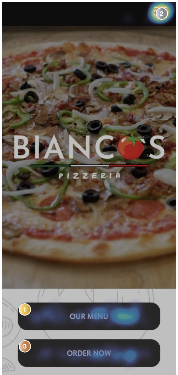
Where "OUR MENU" Led
The menu link routed to a static page — a long scrolling list of pizza names and text descriptions. No photos. No prices visible at a glance. No links. No path to ordering. Item headers were underlined, mimicking the visual language of hyperlinks, causing users to tap them expecting something to happen. Nothing did.
This was confirmed by multiple data sources.
Clarity session recordings showed:
Users clicking into the menu looking for information not available above the fold on the homepage
Users navigating to "Contact Us" looking for a phone number, landing on a list of forms instead
Users scrolling deep into the menu and stalling — long list, no images, no way to make a confident choice
Users tapping the phone number expecting a native dialer to open — it didn't
Users navigating back and forth between the homepage and the menu repeatedly, visibly searching for a way to order
Visible rage clicks
Unmoderated user study — 3 participants:
Sosh: "OOOHH PICTURES. Definitely makes me want to buy more." — visibly excited by food photography, then deflated when the menu had none. Also discovered a UX bug in the Speedline ordering flow: switching from delivery to pickup wiped all address data entered. A frustration that lives outside the website but directly impacts conversion.
Abby: "When I was browsing the menu, I just saw a ton of text, and with food, I usually expect to see an image, especially with pizzas." She also identified a missing persuasion layer: ratings, social proof on individual items, "highly ordered today" signals, a "fan favorites" section. These are conversion optimization features — the kind that make a menu sell, not just inform.
Wilson: Noted that the "Order Now" button should be accessible while browsing the menu — not requiring the user to navigate back to place an order. Also flagged that the menu background could make text hard to read on certain screens.
The pattern across all three: every participant wanted to see food before committing to it. Every participant encountered friction between browsing intent and ordering action. The website was creating consideration when the user had already decided — it just needed to get out of the way.
The Diagnosis — Legacy User Journey
[STITCH PROMPT — Legacy User Flow / Journey Map] Create a flat, horizontal user journey map with two parallel paths showing the legacy Bianco's website experience. Style: clean, minimal, flat design, muted color palette, simple rounded rectangles for steps, thin connecting arrows. Path 1 (top row, label "Menu Path"): Google Search → Bianco's Homepage → taps "OUR MENU" → Static Menu Page (annotate: no photos, no links, underlined non-links create false affordance) → Choice Paralysis / Scrolling → Dead End — No Order Path → Exit. Path 2 (bottom row, label "Order Path"): Google Search → Bianco's Homepage → taps "ORDER NOW" → Speedline Ordering Page → Order Placed (success). Add pain point annotations in small red label boxes at: Homepage (two competing CTAs, equal weight), Static Menu Page (no images, no ordering path, underlined non-links), Contact Us page (forms instead of phone number), phone number (not tappable). Add an emotional state indicator row below each path using simple face icons: neutral → confused → frustrated → exit for Path 1, neutral → uncertain → success for Path 2.
[STITCH PROMPT — Legacy vs. Redesign Side-by-Side Mobile Screens] Flat style side-by-side mobile screen comparison. Left side labeled "Legacy" shows: large pizza hero image, Bianco's logo center, two black stacked buttons "OUR MENU" and "ORDER NOW" equal size, dense text paragraph below. Right side labeled "January 2026" shows: hero with headline "Crafted with care. Cooked to perfection.", phone number and location visible above fold with tap icons indicating they are clickable, single prominent red CTA button "Start Order," pizza specials section with named images below. Use annotation arrows pointing to key changes: single CTA, tappable contact info, business summary above fold, food photography with names. Flat design, clean sans-serif type, no gradients.
The Speedline Problem
When users did reach the ordering platform, they encountered a separate set of challenges outside our direct control.
[STITCH PROMPT — Speedline Legacy Mobile Screen Annotation] Flat style mobile UI annotation of a POS ordering page. Show a long scrolling list of pizza items — text only, small grey placeholder image boxes where photos should be. Annotate with callout bubbles: "No item photography — users must visualize from text alone," "Long undifferentiated list — no hierarchy, no featured items, no social proof," "No 'fan favorites' or 'highly ordered' signals," "Delivery/pickup toggle — switching modes clears all entered address data (discovered in user testing)." Style: clean, muted, flat annotation style, red callout lines.
The Speedline ordering interface — while functional — presents its own friction. Grey placeholder boxes where food photos should be. A long undifferentiated list with no visual hierarchy. No social proof signals. And a confirmed UX bug where switching from delivery to pickup clears all previously entered address data, discovered during user testing and worth raising directly with Speedline.
This matters because the website redesign can optimize the path to Speedline, but if Speedline itself creates friction, conversion still suffers. This is a constraint to document and flag to the restaurant owner.
Design Decisions — January 2026 Redesign
Every change made was traceable to a specific data finding or user research insight.
Single CTA — "Start Order" Eliminated the OUR MENU / ORDER NOW split that was dividing user intent and routing the majority to a dead end. One button, one destination. Language chosen to feel inviting rather than pressuring — "Start Order" implies you can browse and build, not that you must commit immediately.
Tappable phone number and address Confirmed via Clarity recordings that users were tapping the phone number expecting a native dialer. Fixed. Address now opens maps navigation. Both above the fold.
Business summary above the fold Legacy site buried location, delivery area, and context below the hero. Redesign surfaces it immediately — users know within seconds that this is their local Walpole pizzeria that delivers to them.
Named, clickable pizza specials Legacy homepage showed an anonymous grid of pizza photos with no names and no interaction. Redesign names each special and makes them interactive — feeding the visual browsing instinct confirmed by all three user study participants.
Repeated CTA mid-page Users who scroll past the hero get a second opportunity to convert without having to scroll back up.
CTA language note — "Order Now" → "Start Order": The shift in language was intentional and worth testing further. "Order Now" implies immediate commitment. "Start Order" lowers the psychological barrier — it says you can look first. A monthly CTA language rotation is planned once the current phase stabilizes. (Flagged for Phase 3.)