Motion & Visual Craft
Among the first uses of animation at this scale within a Fidelity product. Motion was used selectively: to orient users at launch, signal progress within features, and reach users through the monthly newsletter series. A consistent pastel palette and playful visual style gave a younger audience something that felt less like a financial institution and more like a product built for them.
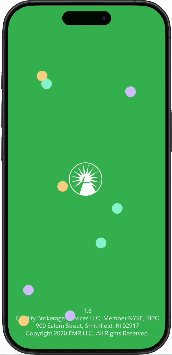
Splash page bubbles
Floating circles reference Spire's goal timeframes and type (short/long/debt). The pastel palette pulls directly from goal color assignments.
Spire Animations
Pastel colors drawn from Spire's goal jar palette. Playful by design, to soften the stiffness of a financial product.


Newsletter series
Three monthly newsletters designed for Fidelity Spire's customer base. Each issue uses a thematic icon treatment and an animated overlay on the hero character image to reinforce the editorial topic.
© 2026 Julia Barbosa. All Rights Reserved